A Guide on Using Colours for Marketing
Colours for marketing
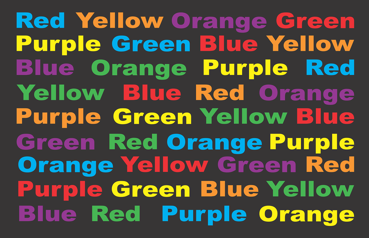
Colours play an essential role in marketing, as they can evoke emotions, influence perceptions and impact decision-making. The right use of colours can help you stand out in a crowded marketplace, convey your brand’s personality and connect with your target audience. In this guide, we will explore how to use colours for marketing and how to choose the right colour scheme for your brand.
Why are colours important in marketing?
Colours are one of the most important elements of branding and marketing, as they can influence customers’ perception of a brand’s personality, values and quality. In fact, studies have shown that people make a subconscious judgment about a product within 90 seconds of seeing it, and up to 90% of that assessment is based on colour alone. Colours can also help differentiate your brand from competitors and create a memorable and recognizable visual identity.
How do colours impact emotions and perceptions?
Colours have the power to evoke specific emotions and associations, which can influence customers’ buying decisions. For example, red is associated with passion, excitement and urgency, while blue is associated with trust, security and stability. Green is associated with nature, health and growth, while yellow is associated with happiness, optimism and warmth. By choosing the right colour scheme, you can create a specific mood or tone that resonates with your target audience.
How to choose the right colour scheme for your brand?
When choosing a colour scheme for your brand, it’s important to consider your target audience, industry, and brand personality. Here are some tips to help you choose the right colour scheme:
- Understand your target audience: Consider your target audience’s demographics, preferences, and cultural background. Different cultures may associate different meanings with colours, so it’s important to be aware of these cultural differences.
- Consider your industry: Look at the colour schemes used by your competitors and consider how you can differentiate yourself. For example, if you’re in the healthcare industry, you may want to use calming and soothing colours such as blue and green.
- Define your brand personality: Consider the personality traits you want to associate with your brand. Are you playful and fun, or serious and professional? Choose colours that reflect your brand’s personality and values.
Using colours to convey your brand’s personality
Your brand’s personality can be expressed through your colour scheme. Here are some examples of how colours can convey different personality traits:
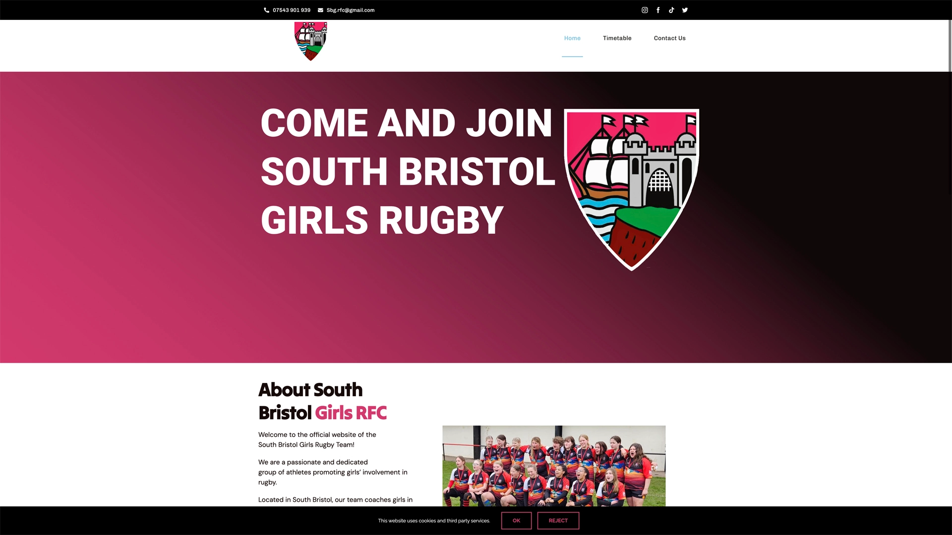
- Red: Bold, passionate, and energetic
- Blue: Trustworthy, calming, and professional
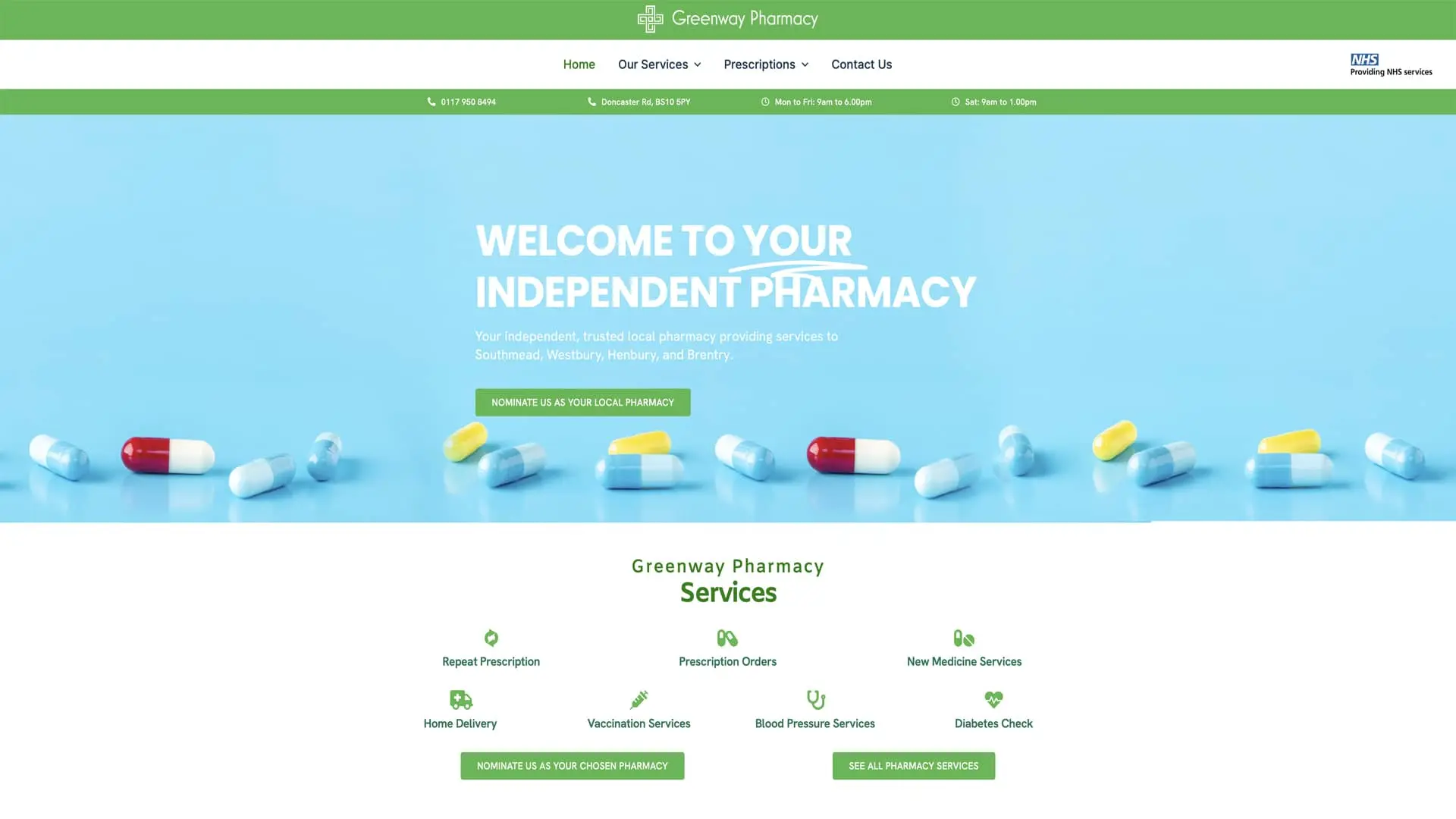
- Green: Natural, healthy, and growth-oriented
- Yellow: Optimistic, cheerful, and playful
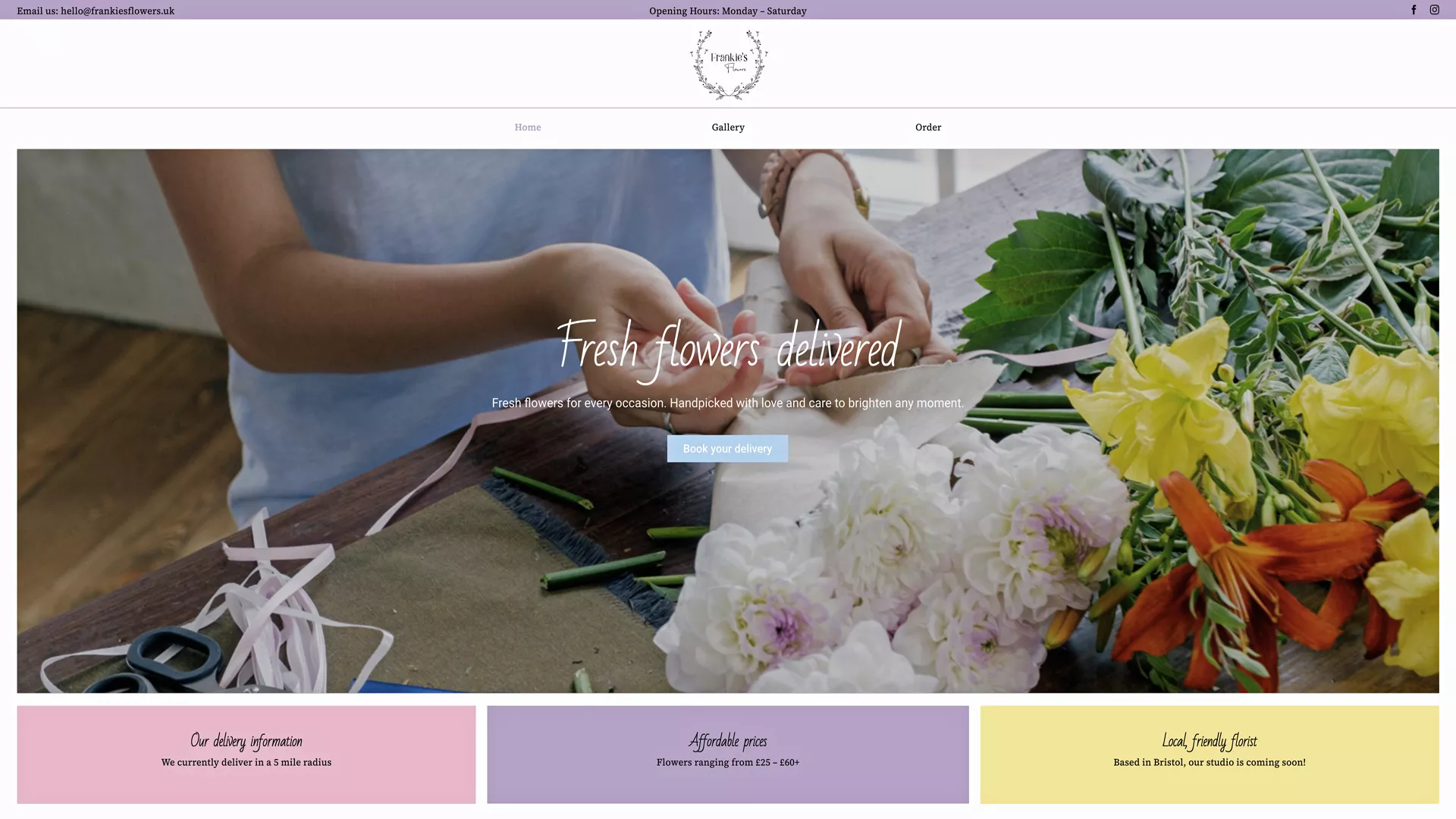
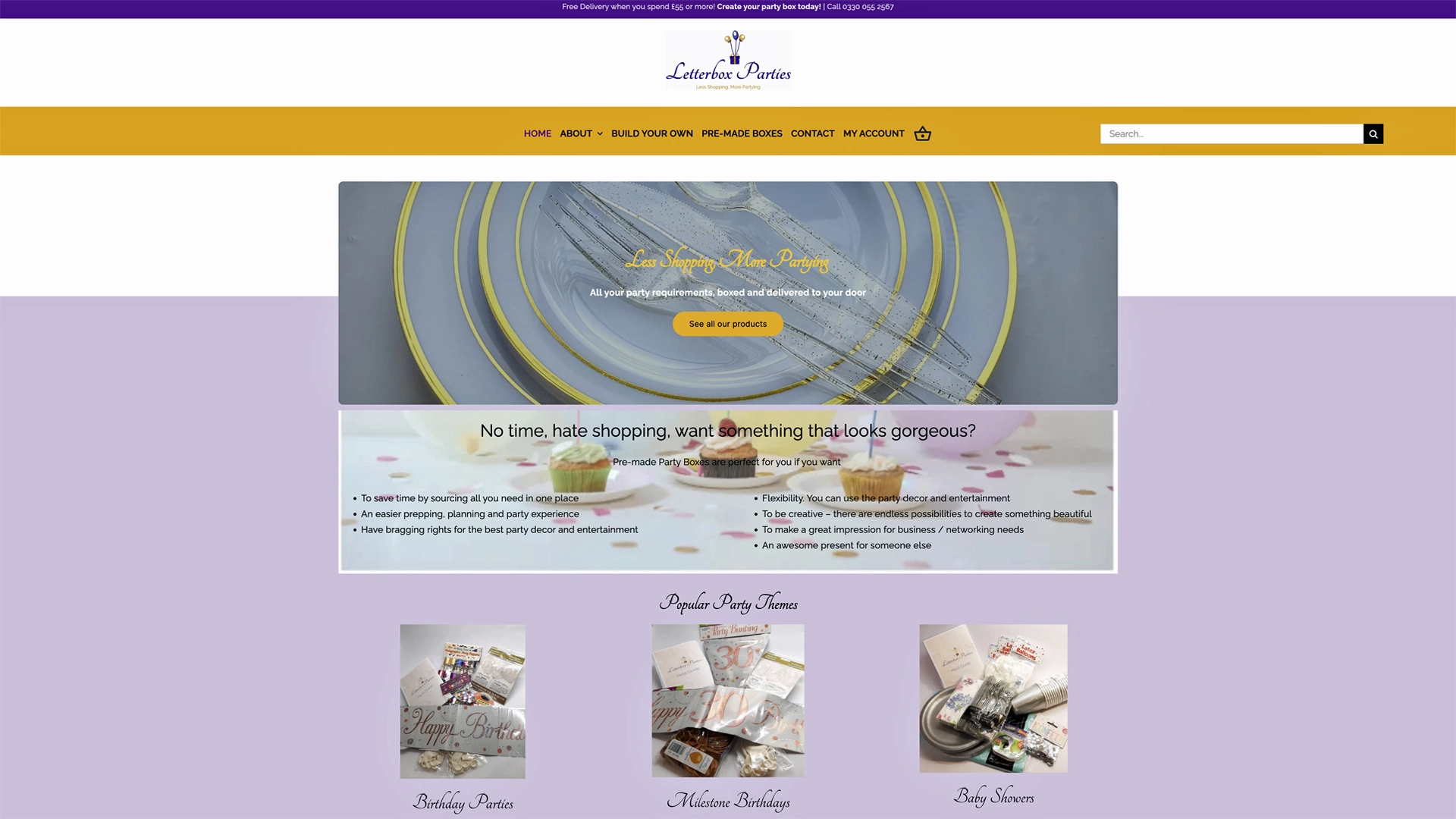
- Purple: Creative, luxurious, and sophisticated
- Orange: Friendly, energetic, and adventurous


Using colours to attract and engage your target audience
Colours can also be used to attract and engage your target audience. Here are some tips to help you use colours effectively in your marketing:
- Use contrasting colours: Use contrasting colours to make your message stand out. For example, use a bright colour against a dark background, or vice versa.
- Use colours strategically: Use colours to draw attention to specific areas of your website or marketing materials. For example, use a bright colour for your call-to-action buttons.
Here are two examples of businesses who have used one of the colours above in their business and for marketing
- Us – Direct Local chose to use the color blue in their branding because it is often associated with trust, stability, and reliability. These are important qualities for a company that provides local services, as customers need to feel confident in the skills and expertise of the professionals they hire. Additionally, blue is a calming color that can promote feelings of peace and serenity, which can be reassuring for customers who may be stressed or anxious about their local service needs. By using blue in their branding, Direct Local is able to establish a sense of trust and dependability with their customers, which can help to build long-term relationships and foster customer loyalty.
- Coca-Cola has used the color red in its branding and marketing for over a century, and it has become an iconic part of the company’s image. One reason for this choice is that red is a bold and attention-grabbing color that can create a strong visual impact. In a crowded market, where many other brands are vying for consumers’ attention, the use of bright and vibrant colors can help a brand stand out and be memorable.
However, there is also a deeper psychological reason behind Coca-Cola’s use of red. The color red is often associated with energy, excitement, and passion, which are all emotions that the company wants to evoke in its customers. By using red in its branding, Coca-Cola is able to create a sense of excitement and anticipation around its products, which can help to build anticipation and drive sales.
Furthermore, red is also associated with happiness and joy, which aligns well with Coca-Cola’s messaging around enjoying life and having fun. The use of red in Coca-Cola’s branding has become so synonymous with the brand that it is now instantly recognizable and has become an important part of the company’s visual identity.


